How the Rebase Consulting logo was created
A logo is the most visible part of a company brand.

People recognise a company with a logo and it helps express how a company differs from its rivals. For employees, a well-designed logo is something to be a proud of, to talk about, to wear and to represent. This is a short story of how the Rebase Consulting logo was created.
First try-outs
The fastest and cheapest way to create a new logo is to use automatic logo maker tools. These tools generate logos in a flash and at a very low cost. The side effect is that the logo is not very customized, unique or beautiful. For Rebase, a generated logo was never a real option, but for some micro-companies this is a suitable choice. If Rebase had decided to use a generated logo it would have looked something like this.

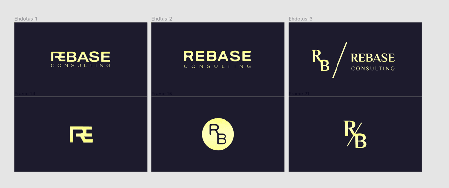
We knew that a logo is not the brand, but the logo felt a natural point to start from. For that reason, the first iteration was to design a logo without any wider brand strategy. We created three different logo versions and almost chose one of them. We were quite happy with these logos, but still something was missing.
The final selection
At the same time the logo selection was in progress, we started to develop the Rebase’s brand and identity. We had a few workshops, where we defined for example our company’s personality, brand core attributes, tone of voice and Rebase’s competitive differentiation. These workshops also helped to understand the requirements for the logo. The next step was to design the logo from scratch one more time. This time we wanted to express some of the brand attributes visually. Some of the elements to play with were the base, moving upwards, the steppingstones and the rhythm of the word. We realised that actually our design process followed the Agile approach: the logo evolves through feedback and repetition. See the iterative logo process below.

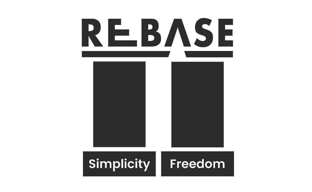
Finally, the Rebase logo was selected. In the end, the choice was quite straight forwarded and clear. From then on, the Rebase consulting logo looked like this.

The soul cannot think without an image
Personally, I’m really happy with the logo. The Rebase logo is fresh, memorable and symmetric. The logo is also not color-fixed, and the emblem matches well with the overall design.
Although a logo won't allow a company to build a respected brand on its own, it definitely has a big impact and influence on the people around the company. It has been said, that all the finest logos gain meaning and power over time. Hopefully this will happen to the Rebase logo as well.
Special thanks to Anmar for the final logo design and Berit for the initial logo concepts work.


